Netizens’ opinions to BABYMONSTER’s new teaser for their upcoming digital single have been mixed.
Babymonster has been hinting at a comeback with a new digital single named “Forever,” following the success of “SHEESH.” Fans were captivated by the initial teaser since it revealed a notion from a storybook.
The poster look was shared on June 21 (KST), reflecting a fresher appeal than the usual.

A number of text blocks with information on the music, including the song credits and minor specifics like copyrights and barcodes, were strewn around this magazine-style teaser, which featured the members at its core.
Online users’ opinions of the image’s design were wildly divided when it was uploaded. When it came to YG’s lack of originality and creativity with the teaser and how it didn’t do the members any justice, many netizens retaliated, despite the fact that some didn’t see a problem and saw it as ammunition for hatred.
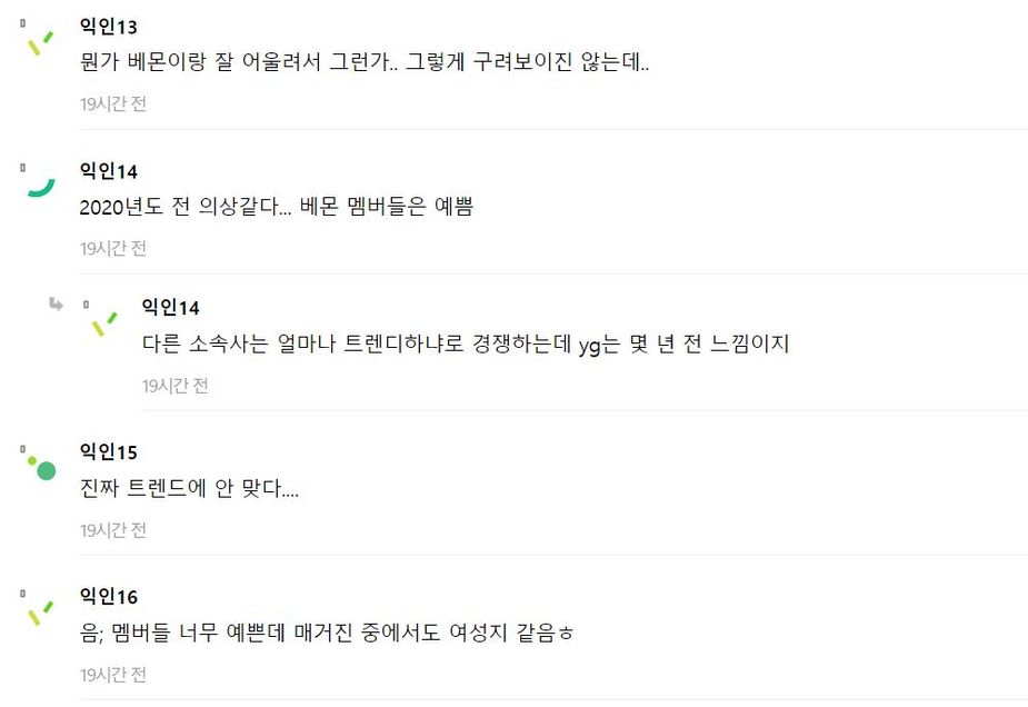
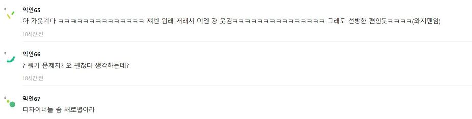
The aforementioned screenshots translates to:
- Maybe because it suits the theme well? It doesn’t look that bad.
- Looks like something from the year 2020… The members are pretty.
- Other agencies are competing on how trendy they can be, but YG feels like it’s stuck a few years back.
- It’s really not in line with current trends…
- Hmm; the members are very pretty, but it feels like a women’s magazine haha.
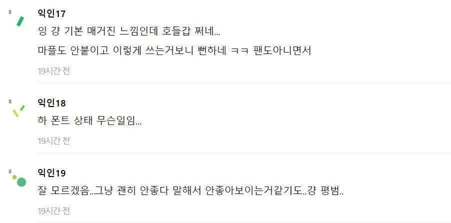
- It’s just a basic magazine look, people are overreacting… It’s obvious those commenting negatively aren’t even fans.
- What’s with the font…?
- I don’t get it… Maybe it’s because people keep saying it’s bad that it looks bad? It just looks average…
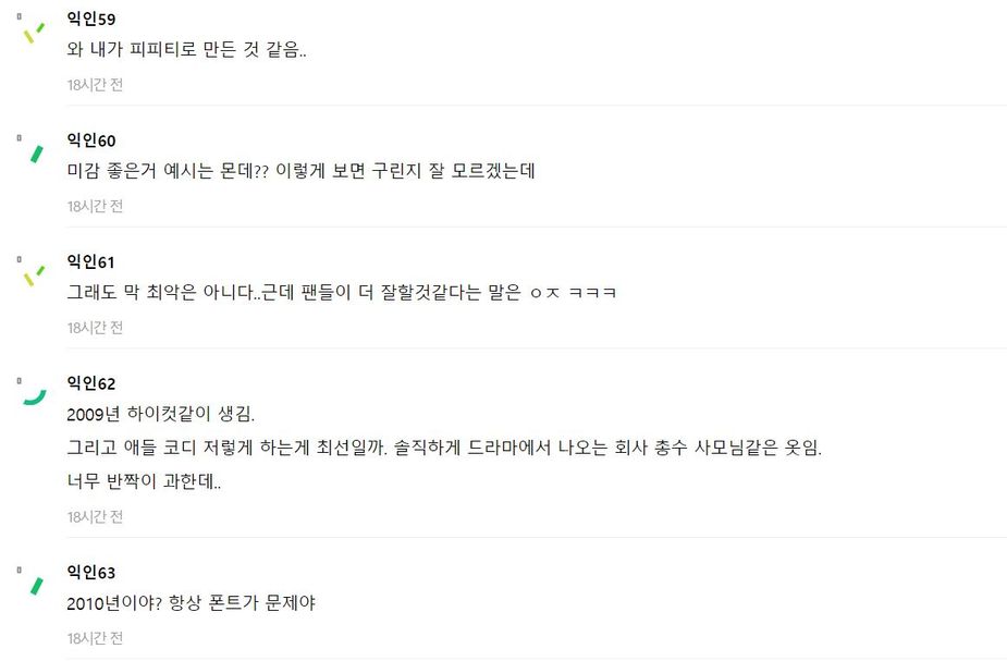
- Looks like something I made on PPT…
- What are good examples of good aesthetics? It doesn’t look bad to me.
- It’s not the worst… But fans probably could do better hahaha.
- Looks like it’s from 2009 High Cut. And are those outfits the best they could do? Honestly, it looks like something a company president’s wife would wear in a drama. Too much glitter.
- Does it look like it’s from 2010? It’s always the font problem.
- Haha, this is funny. They’re always like this, so now it’s just amusing haha. But they did well, considering YG standards (YG fan here).’
- What’s the problem? It looks okay to me.
- Hire new designers.
Compared to the first teaser, this concept photo is significantly different, and not all internet users are fans of the layout.